Create dividend income tracker with Google Data Studio
With transactions registered, it is easy to create a dividend income tracker with Google Sheets. However, a dividend income tracker in Google Sheets is not interactive. Instead of having different pivot tables and switching forth and back among them, I can create an interactive dividend income tracker with a single-page report on Google Data Studio.
In this post, I explain how to create a dividend income tracker with Google Data Studio.

Table of Contents
- Manage stock transactions with Google Sheets
- Create a report in Google Data Studio and connect to Transactions data sources in the spreadsheet
- Use Time series chart to track annual dividend amount
- Use Pie chart to visualize the contribution of dividend among stocks
- Use Pivot table to track annual dividend per share and annual dividend yield of stocks
- Use Pivot table to track dividend amount by month and by year
- Demo
- Conclusion
- Disclaimer
- Feedback
- Support this blog
- Share with your friends
Manage stock transactions with Google Sheets
As same as a dividend income tracker with Google Sheets, a dividend income tracker with Google Data Studio is built also from transactions of a portfolio. I use a spreadsheet on Google Sheets to keep track of my stock portfolio's transactions. Each transaction is a row containing mainly information about Date, Type, Symbol, Amount and Shares of that transaction. There are also others computed fields (Year, Month, Transaction Unit, Cost After A Transaction, Shares After A Transaction, Unit Cost After A Transaction, and Dividend Yield Based on Unit Cost) to support the creation of a dividend income tracker.
For further details, you should read my posts Manage stock transactions with Google Sheets and Dividend Tracker With Google Sheets

Create a report in Google Data Studio and connect to Transactions data sources in the spreadsheet
Google Data Studio can connect to Google Sheets to fetch data stored in spreadsheets and then visualize those data into an interactive and beautiful report.
- Make a copy of the Dividend Tracker spreadsheet presented in this post Dividend Tracker With Google Sheets
- Create a new Blank Report from your Google Data Studio home page
- Connect to the Transactions sheet as a data source for the report
- Select the Google Sheets as the connector
- In the Spreadsheet column, select the Dividend Tracker spreadsheet
- In the Worksheet column, select the Transactions sheet
- Click Add button
- Confirm Add To Report

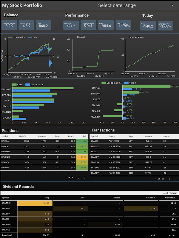
Use Time series chart to track annual dividend amount
I use a time series chart to track the evolution of my dividend income over years.
- From the top menu of the report, select Insert > Time series
- Select Transactions as the data source
- Select Date as Date Range Dimension
- Select Date as Dimension
- Click then the edit button and select Year for Type
- Add SUM Amount as Metric and rename the metric as Dividend
- Add another SUM Amount as Metric and rename the metric as Cumulative Dividend
- Create a filter to select only transactions of type dividend and add the filter into Time series filter in the Filter section
- Activate the Cross-filtering in the Chart interactions section to make the dividend income tracker interactive
- Switch to the Style tab:
- Select Bars, Show data labels for the Series #1
- Select Line, Cumulative and Show data labels for the Series #2

Use Pie chart to visualize the contribution of dividend among stocks
I use a pie chart to visualize the contribution of dividend among stocks
- From the top menu of the report, select Insert > Pie chart
- Select Transactions as the data source
- Select Date as Date Range Dimension
- Select Symbol as Dimension
- Add SUM Amount as Metric and rename the metric as Dividend
- Create a filter to select only transactions of type dividend and add the filter into Time series filter in the Filter section
- Activate the Cross-filtering in the Chart interactions section to make the dividend income tracker interactive.

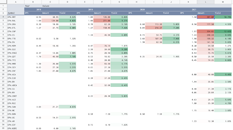
Use Pivot table to track annual dividend per share and annual dividend yield of stocks
I use a pivot table between stocks and years to have an overview picture of annual dividend per share and annual dividend yield of stocks.
- From the top menu of the report, select Insert > Pivot table
- Select Transactions as the Data source
- Select Date as Date Range Dimension
- Select Symbol as Row dimension
- Select Date as Column dimension
- Click then the edit button and select Year for Type
- Add SUM Dividend Yield Based On Unit Cost as Metric
- Rename the metric as Yield
- Select Percent as Type for the metric
- Add SUM Transaction Unit as Metric and rename the metric as DPS
- Make sure columns are sorted Ascending by Year
- Create a filter to select only transactions of type dividend and add the filter into Time series filter in the Filter section
- Activate the Cross-filtering in the Chart interactions section to make the dividend income tracker interactive.
- Switch to the Style tab:
- Select Heatmap fro the Metric #1 which is the annual dividend yield
Note: For further details, you should read my post Dividend Tracker With Google Sheets where I explained how annual dividend per share and annual dividend yields of stocks are computed.

Use Pivot table to track dividend amount by month and by year
I use a pivot table between months and years to have an overview picture of how my dividend income has been distributed by periods.
- From the top menu of the report, select Insert > Pivot table
- Select Transactions as the Data source
- Select Date as Date Range Dimension
- Select Date as Row dimension
- Click then the edit button and select Month for Type
- Select Date as Column dimension
- Click then the edit button and select Year for Type
- Add SUM Amount as Metric
- Make sure columns are sorted Ascending by Year
- Make sure rows are sorted Ascending by Month
- Create a filter to select only transactions of type dividend and add the filter into Time series filter in the Filter section
- Activate the Cross-filtering in the Chart interactions section to make the dividend income tracker interactive.
- Switch to the Style tab:
- Select Heatmap fro the Metric #1 which is the dividend amount

Demo
The sample dividend income tracker with Google Data Studio is available here.. The dividend income tracker is interactive. It is possible to filter by a stock or by a year by simply selecting on the charts.


Conclusion
In this post, I have explained step-by-step how to create a dividend income tracker with Google Data Studio. The process involves registering a portfolio's transactions in a spreadsheet and then creating an interactive report with Google Data Studio. The dividend income tracker gives and overview picture of my dividend income and helps me adjust my decisions to make my investment strategy always on track.
Disclaimer
The post is only for informational purposes and not for trading purposes or financial advice.
Feedback
If you have any feedback, question, or request please:
- leave a comment in the comment section
- write me an email to allstacksdeveloper@gmail.com
Support this blog
If you value my work, please support me with as little as a cup of coffee! I appreciate it. Thank you!

Share with your friends
If you read it this far, I hope you have enjoyed the content of this post. If you like it, share it with your friends!

Comments
Post a Comment