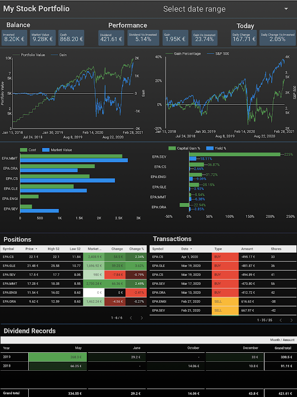
Stock Portfolio Tracker Dashboard With Google Data Studio
In the series of building personal stock portfolio tracker, we have learned how to use Google Sheets to register transactions. We have then used the pivot table and GOOGLEFINANCE function to compute the latest position of the stock portfolio. We have made a step further to use Apps Scripts to compute automatically and daily the stock portfolio's evolution. However, after all, we have several tables of data as the result which do not tell any story yet. We need to present those data in graphs to understand the portfolio's performance and make improvements accordingly. We can effectively plot graphs in different aspects directly in Google Sheets as it provides many charting tools. However, in my experience, having charts and data in the same spreadsheet is not very convenient because charts and tables tend to overlap each other and of lack of interactivity. We should have a dedicated dashboard to have an overview of the stock portfolio and we can do it greatly with Google Data Studio.
Google Data Studio connects to Google Sheets to fetch data stored in spreadsheets and then to visualize those data into an interactive and beautiful dashboard. You can think of this solution as a separation of concerns:
- Google Sheets plays the role of a database to the stock portfolio tracker. We will insert new transactions into it over time. We use built-in functions like GOOGLEFINANCE, pivot table, Apps Script, etc. to compute the position and evolution of the portfolio.
- Google Data Studio plays the role of a graphical user interface to our stock portfolio tracker. It connects to the database, collects the prepared data, and visualizes them interactively and beautifully. It synchronizes closely with changes in the database.
In this post, I will show you how to create your own dashboard to monitor your stock portfolio using Google Sheets and Google Data Studio.

Table of Contents
- Create a report and connect data sources to spreadsheet
- Create indicators with Scorecard
- Track portfolio's evolution with Time series
- Monitor distribution of the portfolio with Bar chart
- Monitor dividend earnings by month and by stock with Pivot table
- Interact with reports
- Note
- References
- Disclaimer
- Feedback
- Support this blog
- Share with your friends
Create a report and connect data sources to spreadsheet
Google Data Studio provides a connector to Google Sheets which allows you to browse your spreadsheets and select exactly which sheet of a spreadsheet you want your report to access. You can connect many sheets to one report.
- Make a copy of the spreadsheet presented in this post Demo stock portfolio tracker with Google Sheets
- Create a new Blank Report from your Google Data Studio home page
- Connect to the Transactions sheet as a data source for the report
- Select the Google Sheets as the connector
- In the Spreadsheet column, select the one that you copied at the first step
- In the Worksheet column, select the Transactions sheet
- Click Add button
- Confirm Add To Report

- Do it again to connect also Positions and Evolutions sheets as data sources for the report
- From the top menu, select Resource > Manage added data sources, we will have 3 data sources as shown in the picture below

Create indicators with Scorecard
As a smart investor, you might want to know how much your stocks currently worth at a quick glance. You can do it with scorecards:
- From the top menu of the report, select Insert > Scorecard
- Select Positions as the data source for this scorecard
- Select SUM Market Value as the metric for this scorecard
- We will have a scorecard Market Value displaying the total value for stocks owned in the portfolio as shown in the sample report above.
As a smart investor, you might want to know how much money has been invested in the portfolio at a quick glance. You can do it with scorecards and filters:
- From the top menu of the report, select Insert > Scorecard
- Select Transactions as the data source for this scorecard
- Select SUM Amount as the metric for this scorecard. Rename the metric as Invested Money
- We only take into account the transactions of types DEPOSIT and WITHDRAWAL to calculate the Invested Money. At the Filter > Scorecard Filter section, add a filter, and configure it as in the picture below.

- We will have a scorecard Invested Money displaying the total value for stocks owned in the portfolio as shown in the sample report above.

As a smart investor, there are many other indicators that you might like to track. Can you create scorecards for those indicators?
- How many stocks are there in the portfolio?
- How much free cash is available in the portfolio?
- How much dividend is accumulated in the portfolio?
- How much is the current gain / loss in the portfolio?
- How much is the current gain / loss compared to the invested money in the portfolio?
Track portfolio's evolution with Time series
As a smart investor, you might want to track the portfolio's value as well as gain / loss over time. You can do it with a time series chart with 2 series: one for the Gain on the right axis and one for the Portfolio Value on the left:
- From the top menu of the report, select Insert > Time series
- Select Evolutions as the data source
- Select Date as Date Range Dimension
- Select Date as Dimension
- Select SUM Portfolio Value as the Metric
- Add the second metric and select SUM Gain for it
- Switch to the Style tab
- In the General section, select Linear Interpolation for Missing Data
- If the Gain and Portfolio Value can not be on the same scale, one can be plotted on the left axis, other can be plotted on the right axis.

As a smart dividend investor, you might want to track the dividend earned over time, by month, and by year. You can do it with a cumulative time series and drill down option:
- From the top menu of the report, select Insert > Time series
- Select Transactions as the data source
- Select Date as Date Range Dimension
- Select Date as Dimension
- Click then the edit button and select Year Month for Granularity
- Activate the Drill down to have options of plotting by month and also by year
- Select SUM Amount as Metric
- Rename the metric as Dividend
- Create a filter to select only transactions of type dividend and add the filter into Time series filter in the Filter section
- Switch to the Style tab
- Select Cumulative for the Series #1

As a smart investor, you might want to track the invested money over time, by month, and by year? Can you do it?
Monitor distribution of the portfolio with Bar chart
As a smart investor, you might want to compare the Cost and the Market Value among stocks of the portfolio. You can do it with a bar chart:
- From the top menu of the report, select Insert > Bar chart
- Select Positions as the data source
- Select Symbol as the Dimension
- Select SUM Cost and SUM Market Value as the Metric

As a smart investor, you might want to compare the Capital Gain % and Yield % among stocks of the portfolio. Can you do it?
Monitor dividend earnings by month and by stock with Pivot table
As a smart dividend investor, you might want to know the distribution of dividends by month and by stock. You can do it with a pivot table whose columns are months of year and rows are stocks presented in your portfolio:
- From the top menu of the report, select Insert > Pivot table
- Select Transactions as data source
- Select Date as Date Range Dimension
- Select Symbol as Row dimension
- Select Date as Column dimension
- Click then the edit button and select Month for Granularity
- Select SUM Amount as Metric
- Rename the metric as Dividend
- Check Show Grand Total for both Rows and Columns in the Totals section
- Select Dividend and Descending for Row #1 in the Sorting section
- Select Month and Ascending for Column #1 in the Sorting section
- Create a filter to select only transactions of type dividend and add the filter into Time series filter in the Filter section
- Switch to the Style tab
- Select Heatmap for the Metric #1

As a smart investor, you might want to know the distribution of invested money by month and by year. Can you do it?
Interact with reports
As I mentioned earlier, with Google Data Studio, you can create a dashboard that is not only beautiful but also interactive. What I mean by an interactive dashboard is the ability to control dynamically which data used to display. With Google Data Studio, you have many ways for adding interactions to your dashboard.
Drill down
If your data is hierarchical, drill-down allows users to switch dynamically between levels of that hierarchy. For example, we can say transactions in a stock portfolio are hierarchical data by time because we can explore those data by year, by month, or even by date. As you have already added the drill-down option into your dividend and invested money time series above, let's see what it actually looks like.

Date range, filter control, data control
So far, you have created several filters and add them to your chart. Those filters are fixed by the report's creators and viewers can not change them. However, Google Data Studio provides also filters that can be controlled by viewers of the report. They are Filter control, Date range (a special type of filter control), and Data control.
As a smart investor, you might want to know the performance of your portfolio during a specific period. You can do it by adding a Date range control to your report:
- From the top menu of the report, select Insert > Date range
- You can select the Default date range as you prefer or let it be the Auto date range as default
You can change then the date range to see the performance of your portfolio last year, last quarter, or last month.

Chart as a filter control
Another interesting thing about Google Data Studio is that you can use directly a chart or a table as a filter control. This feature makes your dashboard very interactive. As a smart investor, you might want to see the performance of not only your portfolio as a whole but also each individual stock. You can do it by checking the box Apply filter in the Interactions section of each chart or table that you want to use as a filter control.

Note
To better understand the overall concept, please check out this post Create personal stock portfolio tracker with Google Sheets and Google Data Studio.
References
- Google Sheets
- Google Data Studio
- Create a data source
- Connect to Google Sheets
- Scorecard reference
- Metric
- About filters
- Time series reference
- Turn on drill-down to explore data hierarchies
- Bar chart reference
- Pivot table reference
- Let your viewers control the date range
- Add chart interaction filters
- Let viewers select the data set used by the report
- About filter controls
Disclaimer
The post is only for informational purposes and not for trading purposes or financial advice.
Feedback
If you have any feedback, question, or request please:
- leave a comment in the comment section
- write me an email to allstacksdeveloper@gmail.com
Support this blog
If you value my work, please support me with as little as a cup of coffee! I appreciate it. Thank you!

Share with your friends
If you read it this far, I hope you have enjoyed the content of this post. If you like it, share it with your friends!


Hi, I was wondering if you can help me out with this - I am trying to create a candlestick dashboard on Google Data Studio where I can easily switch to different stock and monitor its price movements using the drop down filers
ReplyDeleteMy data source is a google sheet of data with the following headers (date/high/low/open/close/volume), with each stock having its own tab within the sheet. This is generated from google finance function.
However, when I tried to blend data based on date, i get 5 different date metrics (each named after the stock/ sheet tab i named). I ended up having a lot of metrics (date/high/low/open/close/volume) x each stock on Google Data studio.
I've tried to ask on reddit and the comment i get was to have all 4 stocks on the same sheet, within the same tab. I'm not sure if that is the best way as I intend to add new stocks whenever I need it: https://www.reddit.com/r/GoogleDataStudio/comments/t20a9y/how_to_create_controls_to_see_different_stocks/
It'd be great if you can advise on how I should approach setting this up on Google data studio. Thank you!
Hi,
DeleteIf I understand correctly your idea, you want to monitor dynamically price of many stocks and to be able to select a stock within a drop-down selection. It means if you select stock A, it should show the prices chart of stock A. If you select stock B, it should show the prices chart of stock B.
If that's the case, I think you only need to organize data in only one sheet, instead of having a separate sheet for each stock. So, that only sheet contains the 6 columns that you already have (date/high/low/open/close/volume), plus the column SYMBOL.
In that case, you don't need to use blend data based on date. You can simply create a drop-down selection based on the column SYMBOL. This drop-down selection should be a single value only, and you should pre-select a default value.
If you add new stocks to the sheet, they should be available for selection immediately in the Google Data Studio dashboard.
Let me know what you think of this solution and whether it helps you. If I have time, I can do a tutorial post on it with more details.
Thanks for stopping by my blog.