Compare stock investment portfolio to market indexes
As investors, we always want to see our portfolio grows over time. If a portfolio made a 1000$ of gain in one year, is it good enough? Should we gauge the portfolio's performance against an alternative investment, for instance, a market index? Should we aim to beat that index? In this post, we will see how to compare a stock portfolio to market indexes by using Google Sheets, Apps Script, and Google Data Studio.

Table of Contents
Select market indexes to compare
In the context of stock investment, investors can compare the performance of their portfolios over a period of time with an alternative investment such as a market index, a portfolio of another investor, or even a single stock if they don't want any diversification, etc. In general, a market index is a good benchmark because it represents the average of the market. Many investors compare their portfolios against the index S&P500 that measures the stock performance of 500 large companies listed on stock exchanges in the United States. However, it depends on how a portfolio is constituted. For instance, if a stock portfolio consists of only stocks in the French market, the S&P500 index isn't an appropriate benchmark. Instead, that portfolio should be compared to the French market's index which is CAC40 that tracks the 40 largest French stocks based on the Euronext Paris market capitalization.
There are lots of indexes to choose from. It depends on markets where your stocks are traded or even your personal preference.
Method to compare
As we want to evaluate the stock portfolio's performance over a period of time, the first thing we need to do is to compute its evolution during that period. In the post, I have explained how to use Apps Script to automate daily that computation. As a result, we have the sheet Evolutions that contains the data for Invested Money, Available Cash, Market Value, Portfolio Value, and Gain for each day since the first transaction date.
By using the GOOGLEFINANCE function in a Google spreadsheet, we can easily fetch historical prices of a market index over a period of time. You can find the symbol corresponding to a market index at the website https://www.google.com/finance.
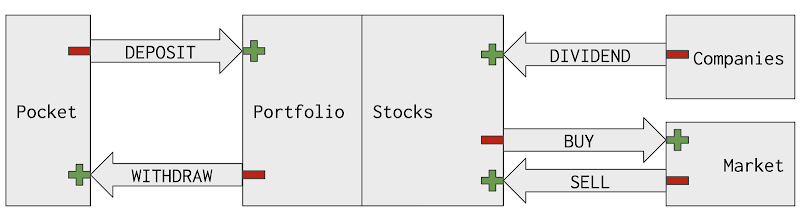
At this point, we can plot on the same time series chart both the Portfolio's values and the market index's prices over the same period of time. What can we conclude about the comparison below? We see clearly that the portfolio's value has increased linearly whereas the CAC40 has fluctuated over the same period. Does it mean the stock portfolio has outperformed largely the CAC40? No, the reason for the linear growth of the portfolio's value is because money has been regularly deposited in the account. You can see those transactions in the sheet Transactions of the Sample Portfolio spreadsheet in this post.

Because of the cash-flow, money deposited into or withdrawn from the investment account, we should not benchmark the stock's portfolio value against a market index. Instead, we can use the stock's portfolio gain percentage. Another problem is that the gain percentage and the market index don't use the same unit. We can plot two series on a dual-axis chart as shown in the below picture. However, it is not a reliable chart to extract insights from. If we change the scale of the left y-axis or the right y-axis, the presentation will be changed significantly. On the left chart, we might have thought that the portfolio's evolution and the market index's evolution have a similar trend. On the right chart, with the same data, the two evolutions differ a lot because the scale of the right y-axis has changed from (3k, 7k) to (0, 10k).

To resolve that problem, we should plot the two evolutions on the same y-axis with the same unit which is percent. To do so, we need to select a reference price for the chosen market index and we compute how many percent has changed between the market index's price on a given date compared to the reference price. For instance, the reference price can be the price of the market index on the first transaction's date of the portfolio. By so, the two evolutions will both start with 0% on the first transaction's date of the portfolio.

Guides
Prepare data with Google Sheets and Apps Script
In this post, we have used Apps Script to generate daily evolutions of the portfolio into the sheet Evolutions. The data we still miss are Gain Percentage, and change by percent of market indexes compared to their prices on the first transaction date of the portfolio.
- Define in the sheet Indexes all market indexes that we want to compare our stock portfolio to. You can find the symbol corresponding to a market index at the website https://www.google.com/finance.
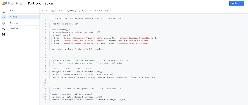
- In the Apps Script editor, add the new function extractIndexes to extract market indexes defined in the sheet Indexes
- In the Apps Script editor, update the function generateHistoricalPricesSheets to generate also historical prices sheets for all indexes in the sheet Indexes
- In the Apps Script editor, add the new function getFirstPriceBySymbol to extract the first price in a historical prices sheet
- In the Apps Script editor, update the function generateDailyEvolution to compute the Gain Percentage of the portfolio as well as change by percent of market indexes defined in the sheet Indexes compared to their prices on the first transaction date of the portfolio.
The latest script can be found in this github repository.
As we have already defined two time-based triggers for the two functions generateHistoricalPricesSheets and generateDailyEvolution, we will have the sheet Evolutions automatically updated every day before 8 a.m.
You can find the sheet Evolutions and Indexes in a sample spreadsheet presented in this post.
Visualize benchmark in Google Data Studio
In this post, we have already added the sheet Evolutions as a data source to the report in Google Data Studio. Since new columns have been added to the sheet, we need to update the data source to make sure those columns are correctly connected to the report.
- Select Resource on the menu, then Manage added data sources menu item
- Click EDIT on the data source corresponding to the sheet Evolutions
- Click EDIT CONNECTION on the top left of the menu
- Click RECONNECT button on the top right of the menu
A dialogue appears to ask for confirmation of applying changes. The changes consist of new fields: Gain Percentage, CAC40, and S&P 500 because they are two market indexes chosen in the sample spreadsheet.

With the data ready, we can visualize the comparison between the evolution of portfolio and market indexes on a time series chart. We can modify the Main Dashboard to make room for a new chart or we can create a new page Benchmarks specifically for it.
- Find the Add a new page button on the top left of the toolbar to add a new page and name it Benchmarks

- Insert a Time series chart into the page
- On the DATA tab
- Select the Sample Evolutions as the data source
- Select Date as Date Range Dimension
- Select Gain Percentage as the first metric
- Select CAC 40 as the second metric
- Select S&P 500 as an optional metric
- On the STYLE tab, select the option Linear Interpolation for the Missing Data
- Insert a Date range control into the page to filter chart by date range

As a result, the evolution of portfolio and market indexes are visualized beautifully and interactively as below. We can select a specific date range to see more closely the difference between series. From the menu of the optional metrics, we can show or hide a series. All series start from 0% on the first transaction date of the portfolio. It is clear that my sample portfolio doesn't have a chance to compare with the index S&P 500. As the portfolio consists of only stocks in the French market, its evolution is closer to the index CAC 40. Before 2020, the portfolio witnessed a very poor performance compared to the index CAC 40, but since then, it has caught up the index thanks to some good decisions in the investment strategy.
Demo
- You can find the sheets Evolutions and Indexes in the sample spreadsheet presented in this post.
- The Benchmarks dashboard can be found here.
Conclusion
By using Google Sheets, Apps Script, and Google Data Studio, we can evaluate the stock portfolio's performance vs a market index. It is important to recognize the impact of the cash-flow (when money is deposited into or withdrawn from the investment account) in evaluating the stock portfolio's performance. On a time series chart, we can identify when the portfolio loses track of the market index and hence make adjustments in investment strategy to improve the performance.
If you find this post interesting, please do share it! Thank you!
Note
To better understand the overall concept, please check out this post Create personal stock portfolio tracker with Google Sheets and Google Data Studio.
References
- Google Apps Script
- Fundamentals of Apps Script with Google Sheets #2: Spreadsheets, Sheets, and Ranges
- Add pages and report navigation
- Time series reference
Disclaimer
The post is only for informational purposes and not for trading purposes or financial advice.
Feedback
If you have any feedback, question, or request please:
- leave a comment in the comment section
- write me an email to allstacksdeveloper@gmail.com
Support this blog
If you value my work, please support me with as little as a cup of coffee! I appreciate it. Thank you!

Share with your friends
If you read it this far, I hope you have enjoyed the content of this post. If you like it, share it with your friends!


Comments
Post a Comment